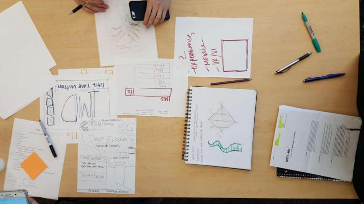
During Friday’s class, I did not get the opportunity to attend class due to a leadership conference. However, I did take the time to call my group members and understand the ideas that they were braining storming for the design activity. Helped me understand that you have the agency to take initiative in what you want to accomplish. This idea helped me understand that when you have the agency to design, like Tyler Fox would say, “Design like you give a damn”. With that said, the first thing that my group focused on was the experience that they wanted to convey to audience. With experiences being crucial to the poster, we wanted the audience to understand the interactions that the senior class incorporated in each project. They brought these thoughts together, the poster that they prototype were based on these ideas. Although I wasn’t in class with my teammates, I got to look over the though process through the phone call and more importantly the notes. Something that I found important was not only designing the experience and interaction, but the color schemes and structure that were used. The color scheme of the poster would be neutral colors because the focus of the poster is to have it look like a frame. However, I still have the question my teammates on the importance of this frame. The color scheme would focus on using logos from all the senior teams and using those true colors to make each team unique. The next steps for me as a teammate is to understand the team structure and find out what I missed on Friday’s class.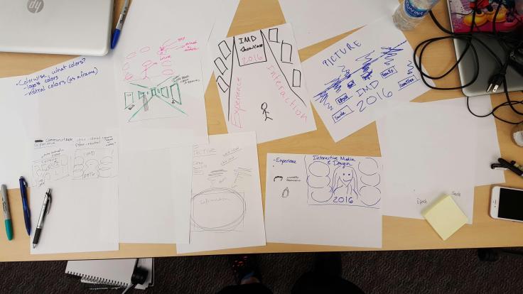
- Comment
- Reblog
-
Subscribe
Subscribed
Already have a WordPress.com account? Log in now.

Leave a comment